css-18: media-queries
mdeia-queries
- Media query는 오직 CSS만을 이용해서 스크린의 사이즈를 알 수 있는 방법이다.(웹사이트를 보고 있는 사용자의 스크린 사이즈)
- @media screen and (max-width: 00px) {} 을 이용하여 몇 픽셀부터는 달라보이도록 만들 수 있다. 이를 통해 스크린의 사이즈를 알 수 있다.
- min 사이즈와 max사이즈를 조절하여 단계별로 만들면, 스크린 사이즈의 범위를 알 수 있다.
- 브라우저에서 inspect의 device toolbar를 이용하여 핸드폰 기종 별 사이즈로 브라우저를 볼 수 있다.
- media screen에 (orientation: landscape)를 이용하면, 세로모드인지 가로모드인지도 구별 할 수 있다.
body {
  display: flex;
  flex-direction: row;
  align-items: center;
  justify-content: center;
  height: 100vh;
}
div {
  background-color: teal;
  width: 200px;
  height: 200px;
}
@media screen and (min-width: 601px) and (max-width: 1200px) and (orientation: landscape) {
  div {
    background-color: tomato;
  }
  span {
    font-size: 36px;
  }
  @media screen and (orientation: landscape) {
    span {
      display: none;
    }
  }
}
    <div></div>
    <span>Please filp your Phone :(</span>
  </html>
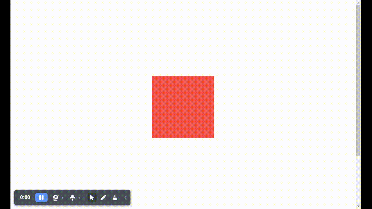
- 윈도우 창의 너비가 601~ 1200px 일때 상자의 배경색이 토마토색으로 변함

- 가로모드일때 토마토색으로 변환, span제거
- 세로모드일때는 색깔그대로, span그대로
댓글남기기